9. Efficiency maps
An efficiency map shows how efficient the motor is across its whole speed–torque range, not just at the nominal point. Use it to check that the motor is efficient where your application actually spends its time, such as a drive cycle, a partial-load cruise or an overload.
Generating a map
- Select the revision you want in the revision bar.
- In the Max Current card, set Max input current for efficiency map (guide 8).
- Click Generate Efficiency Map.
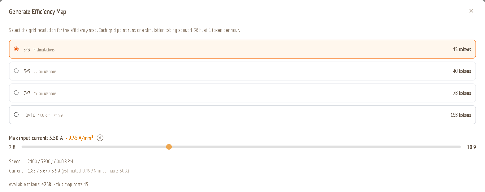
| Option | Meaning |
|---|---|
| Grid resolution | 3×3 (9 simulations), 5×5 (25), 7×7 (49) or 10×10 (100). Each grid point is one simulation. The token cost is shown on the right, based on the estimated run time (in the example about 1.58 h per point, at 1 token per hour). |
| Max input current | Same ceiling as in the Max Current card, shown with its current density. You can still adjust it here. |
| Speed / Current | The exact speeds and currents the grid will simulate. |
| Available tokens / this map costs | Your balance and the cost of the selected grid. |
After you confirm, a message tells you how many simulations were queued and how many tokens were charged. If your balance is too low, you'll see "This map costs X tokens but you have Y."
Performance Metrics
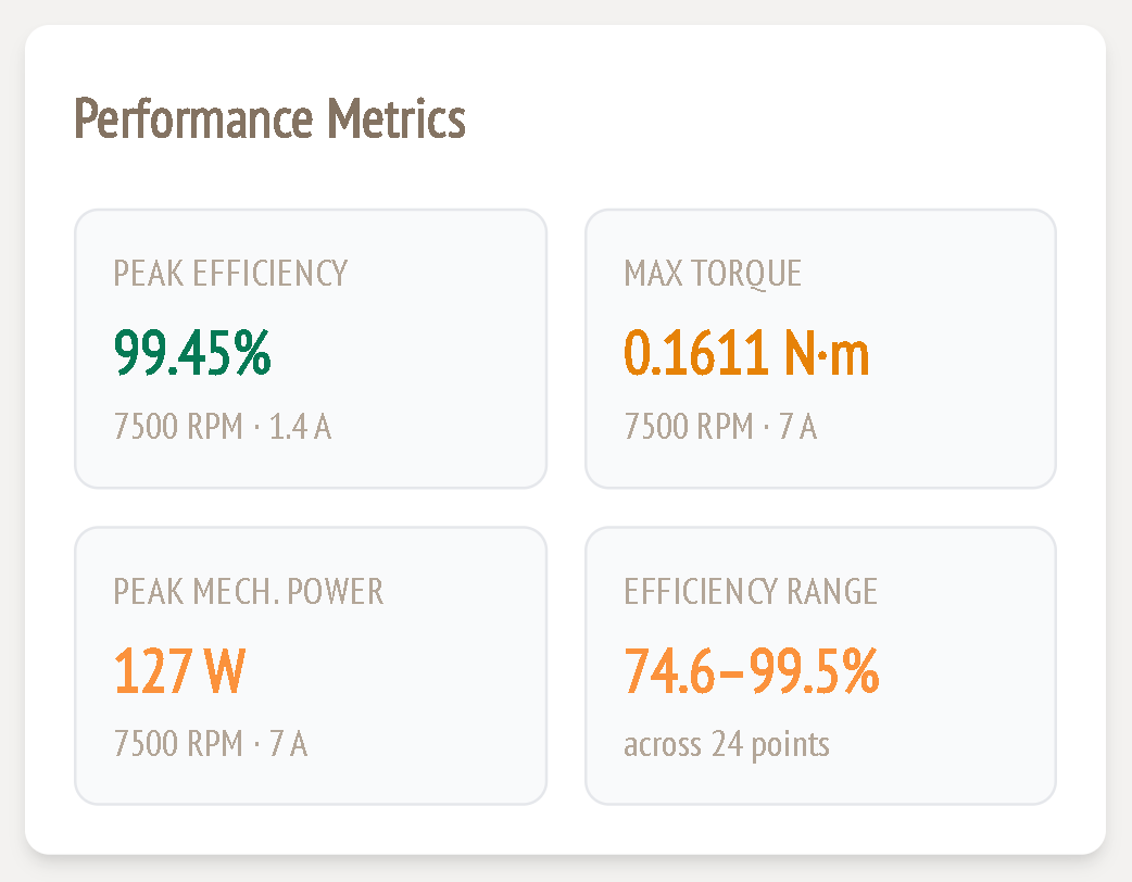
This card summarises the map:
| Metric | Meaning |
|---|---|
| Peak efficiency | Highest efficiency of any map point, with the speed and current where it happens |
| Max torque | Highest torque in the map, and where it happens |
| Peak mech. power | Highest shaft power in the map, and where it happens |
| Efficiency range | Lowest to highest efficiency, and the number of points that completed |
Efficiency Map
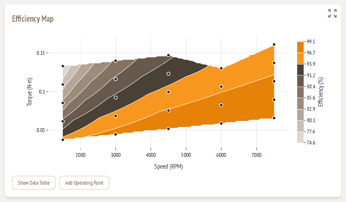
- X axis: speed (RPM). Y axis: torque (N·m).
- Colour bands: efficiency (%), with the scale on the right. Orange is the highest range, browns are the middle, and light grey is the lowest.
- Dots: the simulated grid points. The coloured surface between them is interpolated.
- Upper edge: the torque reached at the maximum current at each speed.
How to read it: find your application's operating points on the map and read their efficiency. Ideally your most-used region sits in the highest band.
A coreless motor has no iron losses. Its losses are mainly copper (I²R), which depends on torque, and eddy currents in the winding, which depend on speed. So efficiency is usually highest at high speed and moderate torque, and lowest at low speed and high torque.
Show Data Table
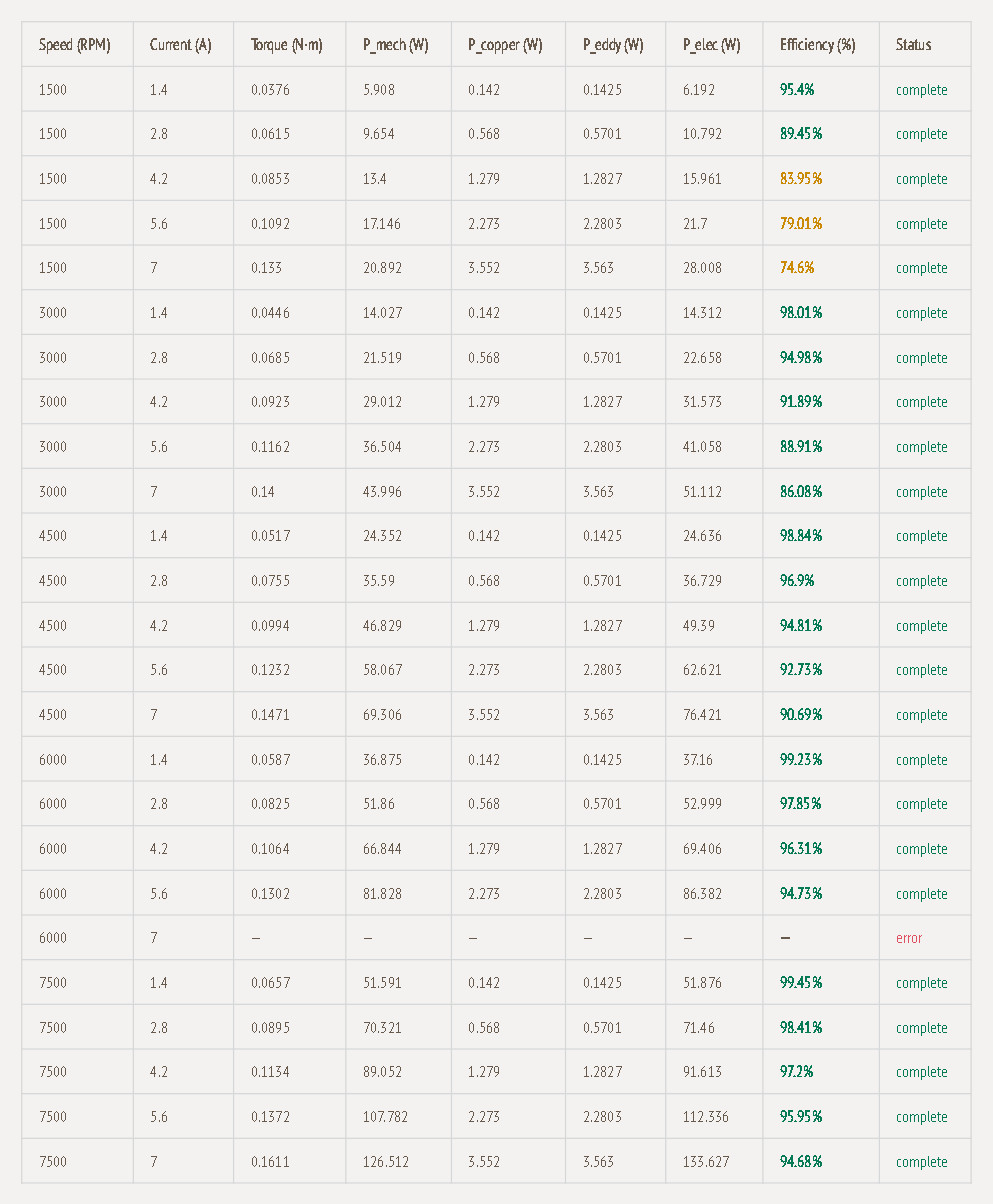
Click Show Data Table to see the numbers behind every point:
| Column | Meaning |
|---|---|
| Speed (RPM), Current (A) | The grid point. The current is the peak phase current. |
| Torque (N·m) | Simulated shaft torque |
| P_mech (W) | Mechanical output power = torque × ω |
| P_copper (W) | Winding resistive loss |
| P_eddy (W) | Eddy-current loss |
| P_elec (W) | Electrical input = P_mech + P_copper + P_eddy |
| Efficiency (%) | P_mech / P_elec, coloured green (85 % or more), amber (70–85 %) or red (below 70 %) |
| Status | complete, or error if that point's simulation failed |
If a point shows error, the map is drawn from the remaining points. You can re-simulate a missing point with Add Operating Point.
Operating point detail (click a row)
Click any complete row in the data table to open its Operating Point Detail directly underneath. The header shows the point, e.g. 3000 RPM · 4.2 A. Two tabs let you look inside that simulation.
Loss Breakdown
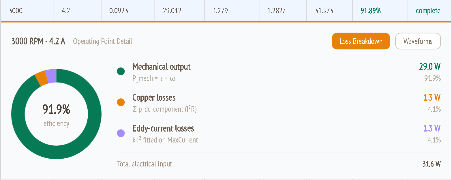
The ring chart splits the total electrical input into where the power goes. Efficiency is in the centre.
| Item | How it's calculated | Example (3000 RPM, 4.2 A) |
|---|---|---|
| Mechanical output | P_mech = τ × ω, from the simulated torque | 29.0 W (91.9 %) |
| Copper losses | Sum of the I²R losses in the winding (Σ p_dc_component) | 1.3 W (4.1 %) |
| Eddy-current losses | k·I², where k is fitted to the Max Current sweep | 1.3 W (4.1 %) |
| Total electrical input | Sum of the three above | 31.6 W |
The percentages are shares of the total electrical input, so the mechanical share is the efficiency. Use this view to see which loss dominates at a given point:
- If copper losses dominate, more copper helps: thicker copper, more layers or more parallel paths.
- If eddy losses dominate, narrower traces help.
Waveforms
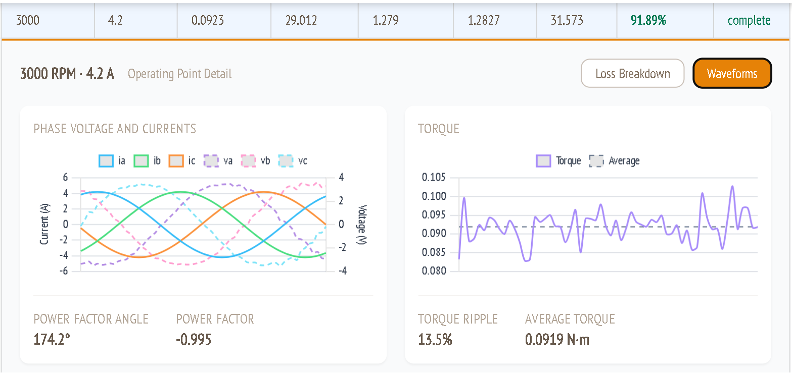
Phase voltage and currents
- Solid lines: the three phase currents ia, ib, ic (left axis, A).
- Dashed lines: the phase voltages va, vb, vc (right axis, V), over one electrical period.
- The current amplitude matches the grid point's current. In the example the currents peak at about 4.2 A, so the table's Current (A) is the peak phase current.
- Power factor angle / Power factor: the phase shift between voltage and current, and its cosine. A magnitude close to 1 means voltage and current are well aligned. The sign depends on the reference direction used for the voltage.
Torque
- The simulated shaft torque over the same period (solid), and its average (dashed).
- Average torque is the value used in the data table.
- Torque ripple is the torque variation relative to the average. In a coreless motor there's no cogging, so ripple comes from back-EMF harmonics and current shape. Lower it with the magnet span angle (guide 4 and the Harmonics tab in guide 8).
Add Operating Point
Use this to simulate specific points that matter to your application without paying for a denser grid.
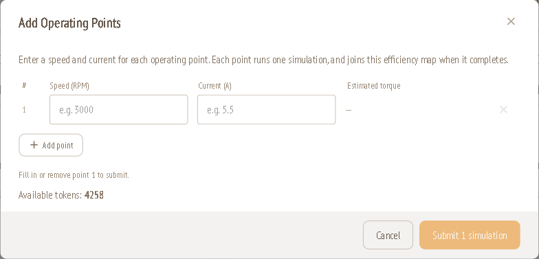
- Click Add Operating Point.
- Enter a Speed (RPM) and Current (A). The dialog shows the estimated torque for that current.
- Click Add point to add more rows. Remove a row with ×.
- Check Available tokens, then click Submit N simulation(s).
Each point runs one simulation and joins this efficiency map when it's done.